New college website to enhance the student experience
Selby College is a highly rated and successful college in North Yorkshire. It provides a wealth of courses across all levels and to all types of users.
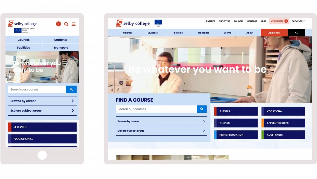
We started working with the college in Summer 2020. The existing website was outdated and required a complete overhaul. We worked closely with the college marketing department through stages of research and consultation, prototyping and design to put in place a framework and design solution that would meet their key goals.
- It was key that the user experience must be improved. The journey from browsing course information through to application must be seamless and handled online.
- Students should have a much more prominent position on the website. Prospective students want to hear from and understand the experiences of current students.
- Engaging users through possible careers destinations would be beneficial to those students who didn’t know which courses to take. This would also help with student retention where clear progression routes from a course were transparent and clearly signposted
- There are a number of competitor colleges within the region, however none offer the facilities and spacious campus that Selby can. Therefore this must be showcased and made clear.
We launched the new website in March 2021 having worked through the national pandemic and a number of regional and national lockdowns. We built a fantastic relationship with the Marketing and IT teams at the college to deliver the website on budget and to the agreed timeframes.

We wanted to create a seamless user experience where potential students could easily browse courses, read about real experiences from Selby College students and gain insight into what it's really like to study at the College. Our brand-new website does exactly this, whilst also creating a sense of place and familiarity for our existing students and stakeholders.
Personalising course selection
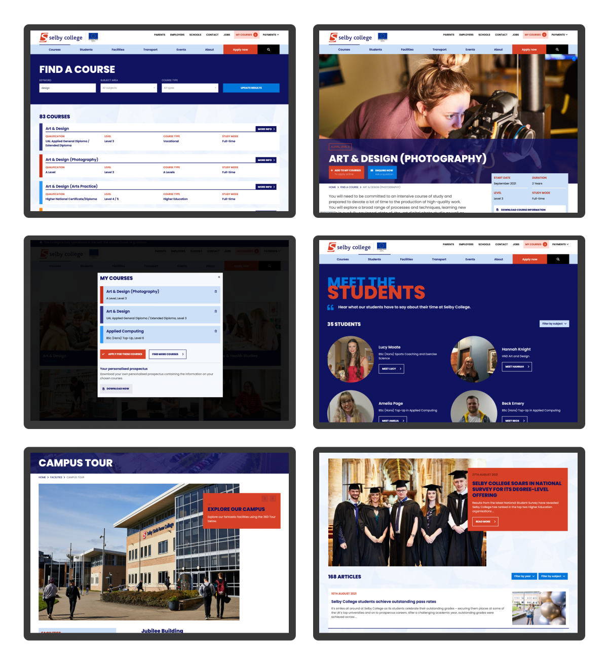
A core focus of the new website was to improve the user journey and experience around course selection and application. It had to be clear, easy to use and increase conversion. We introduced an ‘Add to my courses’ option where prospective students can build up a selection of courses they were interested in - much like adding items to a basket or wish-list on a shopping website.
From here, users can download a personalised prospectus containing the courses they have selected - dynamically pulling content from the website into an automatically generated PDF file.
Users can then continue to apply for their selected courses online.
Careers data
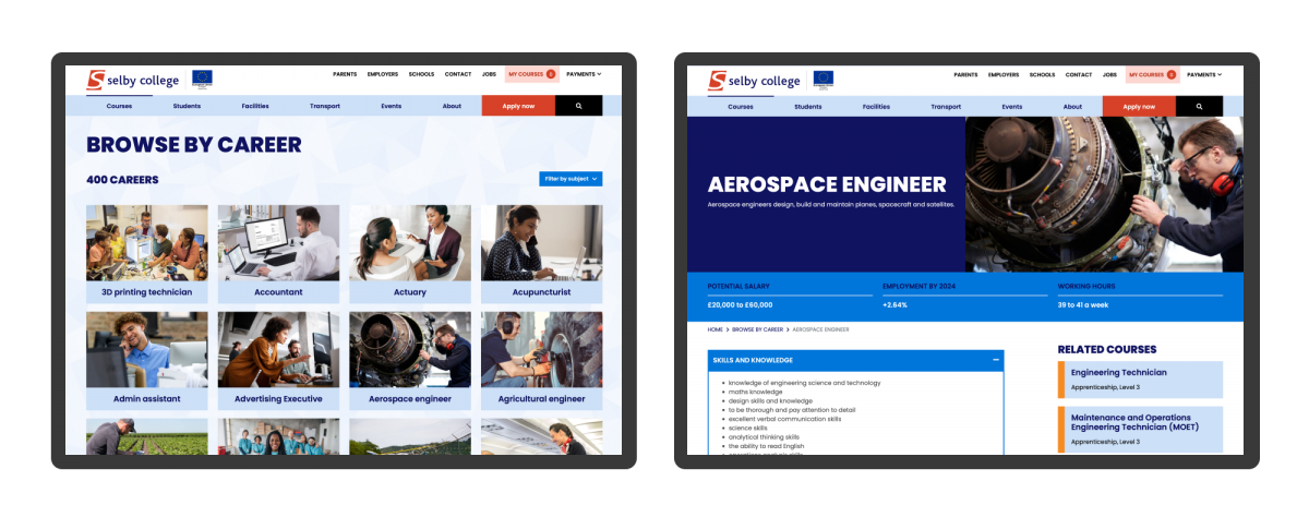
Some of our early conversations with the college focused on bringing careers data into the website. We are very aware that prospective students don’t always know the course they want to apply for and it was important to us that the new website engaged with users through possible careers and highlighted the paths they could take - all mapped to the college’s courses.

Using our Pathways data sets, we have built a careers section into the website that showcases possible careers. Key data about each career is displayed including potential salary, working hours, skills required and career tips and is all linked to courses within the college that can help the student get to that career.
The college also use our Pathways tool across their course pages to map their courses to future careers.
Meet the students
Through our own research and experience of working in the education sector, we see that prospective students respond better when addressed at their own level and in a voice to which they can relate.
The new ‘Meet the students’ section is a great way for prospective students to engage with the college and hear firsthand from existing students about college life. They showcase academic successes, particular achievements and career progression. With the aim of reminding prospective students that their own goals are achievable at Selby College.
These student profiles are consistently displayed throughout the website, with related students appearing alongside subject and course content to increase engagement and bring a student voice to the fore.

What we did
- User experience
- User interface design
- Wireframing
- User research
- Usability testing
- Information architecture
- Visual design
- Responsive design
- Website development
- Content Management Systems


