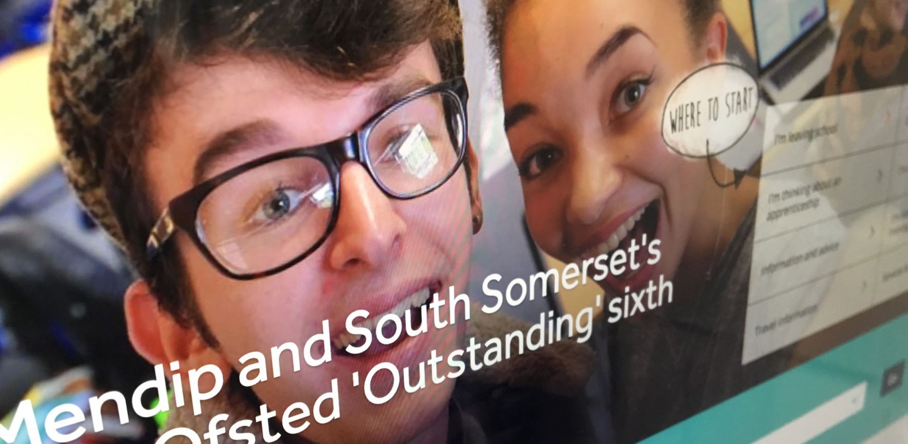
A vibrant college website to reflect its personality
Mobile first and deeply integrated with Unit-e, we have re-built the website for Barking & Dagenham College to help showcase the real college.
When we were first contacted by Barking & Dagenham College, they were very open about their current website. They knew there was work to be done and improvements to be made across the entire site.
They had some key requirements that formed part of their initial brief:
- Mobile first
- Easy to search
- Personalised prospectuses
- Add to ‘my courses’
- Support students who didn’t know what they wanted
- Integration with Unit-e and automation between it and the website
Our presentation to the college
In our initial presentation to the Senior Leadership Team at the college we were keen to demonstrate our sector knowledge:
- We know the sector well and have experience across a range of projects
- We understand the student audience and how they commonly use the internet and digital tools
- We have vast experience of integrating with third party systems and tools, including Unit-e for other colleges
- And it was important to us that students were at the core of the project
In the early stages of discussion, there were some specific areas that we felt were key. Finding courses was incredibly hard on the current site and was the single most important task. The new website must portray the student voice, be simple and engaging and allow prospective students to see inside the college.
The website must be mobile first and support users across any type of device. And it should be clear where studying on a course can lead you - to demonstrate progression.
What we did
We worked closely with the marketing team from the college throughout the process with regular presentations to the Senior Leadership Team.
Research phase
A crucial first phase of the project was to really understand the college. To experience it’s personality and get a true sense of who it was and where it was placed within the community. To engage with the students and understand how they saw the college. And to speak with the leaders within the college and understand the direction in which the college was travelling.
Within the first few weeks of being awarded the project we spent 3 full days on-site speaking with a range of people across the college and running a variety of sessions. It was important we were very visible within the college across this period, creating a collaborative and inclusive process where everyone could get behind the project and contribute.
Consultation sessions
We held separate consultation sessions with different stakeholders to further understand the college, the needs of its users and understand goals and objectives of the new website. We ran open discussion sessions with the Senior Leadership Team, student groups, staff and the technical teams within the college.
User journey mapping
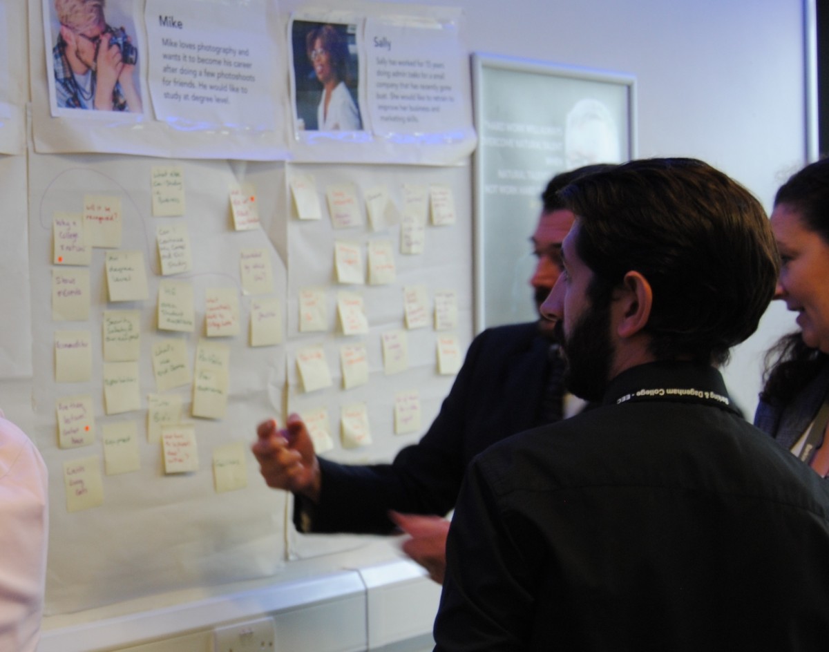
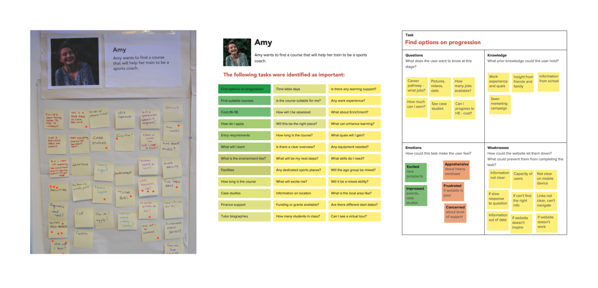
We ran interactive workshops with different groups of people from within the college. To understand the needs and requirements of the target users in greater detail, we constructed user personas for four of the college’s target audience types.
Working in small groups, individual tasks were identified and written on separate post-it notes. These were then brought together and the group as a whole carried out a "dot-voting" exercise to identify the most important tasks.
To delve further into the experiences the user would be going through during these tasks, each small team took one of the single tasks and began to map out the journey a user would be going through when attempting this task. This took the form of identifying Questions, Knowledge, Emotions and Weaknesses that would, or could, be experienced by the user.
A clear picture formed on how the website must support each user on their respective journeys.
Identifying clear benefits
Working with a group of students we ran an interactive workshop to discuss and highlight the key benefits of studying at the college.
Following a 45 minute consultation session, we split the group into pairs and gave them 15 minutes to write down as many single benefits they could think of, each on a separate post-it note.
We then brought the ideas together and conducted “dot voting” - where each student was given 5 dots that they had to place on what they felt were the most pertinent benefits or values of being a student at the college.
Usability testing
We carried out one-to-one usability tests with staff and students from across the college. Within these sessions we asked the users to perform a number of tasks using the college website and a number of other college websites.
These tests were carried out on either a laptop or a phone, to get a sense of how people respond to the websites when on different devices.
The purpose of these tests was to gain an insight into how their target audience responds to certain content types, terminology, design and navigational structures on college websites. It also illustrates areas of websites that work well and those that don’t work.
Learning from the research
We learned many things from our research and consultation phase, which we presented back to the college in an evidence-based report. Key outcomes in the report included:
- Tell your story
There is a clear need for the new website to truly convey the college’s personality and reflect its stature. - Clear and simple
It sounds like an obvious statement, however a new website must be easy to use. From all of the research undertaken it was the most commonly referenced issue with the current website - can’t find content, too much content, don’t understand terminology, too confusing. - Real people
“Your people are your biggest selling point” was a phrase that came out of one the consultation sessions and is absolutely true. As such, the new website had to focus on real people. Students are one of the college's biggest assets and prospective students want to hear from them. - Courses
This is undoubtedly the core area of the website and it must engage with students, showcase the college’s courses and promote progression onto careers and further learning.
The design process
Our design process included a number of steps including the creation of wireframe prototypes to quickly demonstrate and test page layouts, information hierarchies and key routes through the website. These were initially sketched on large sheets of paper and presented to the Senior Leadership Team.
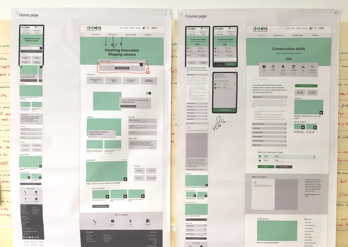
They were iterated upon, then turned into interactive prototype screens that we tested with real users at the college to confirm our own design decisions and to test that key routes through the website were achievable and easy.
We then worked closely with the college’s brand and marketing material to produce a visual design that would support the usability and create an engaging user experience.
There were many aspects that formed the direction of the design and the overall approach, however there were some key elements that came out of the research phase that helped shape the new website.
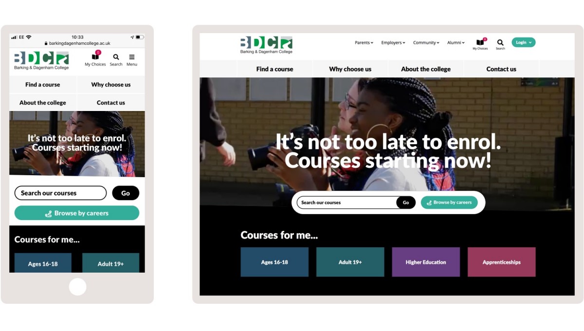
Video content
It was referenced many times in discussions with students that video content was the most sought after medium for consuming content and key information. In the context of conveying personality and an environment, it was the perfect medium to communicate the real Barking & Dagenham College.
Students felt it was more believable to see a current student talking about a course or the college and felt they could relate more to a real student than a corporate voice.
Career focused
It was identified several times throughout our research that understanding what you can do after the course plays a crucial role in choosing that course in the first place. The new website should support users and help them understand progression routes and possible careers following each course.
It was discussed that not all students know the course they wish to study, therefore the website should take a careers-first approach and allow students to follow a path through the website based on a career type or job sector, helping them to identify a route to a career and the most suitable courses on which to study.
The new website also utilises Pathways throughout. This embeds careers and progression information directly in the course and career pages giving students clear and high quality information on future career options, all mapped to the course page they are viewing.
Easy on mobile
Whilst perhaps an obvious point, the approach to creating the new website for the college had to do more than just ticking a box that it was responsive and worked on mobile. With such a high percentage of users using small screens, our whole approach to developing a design solution was “mobile first”.
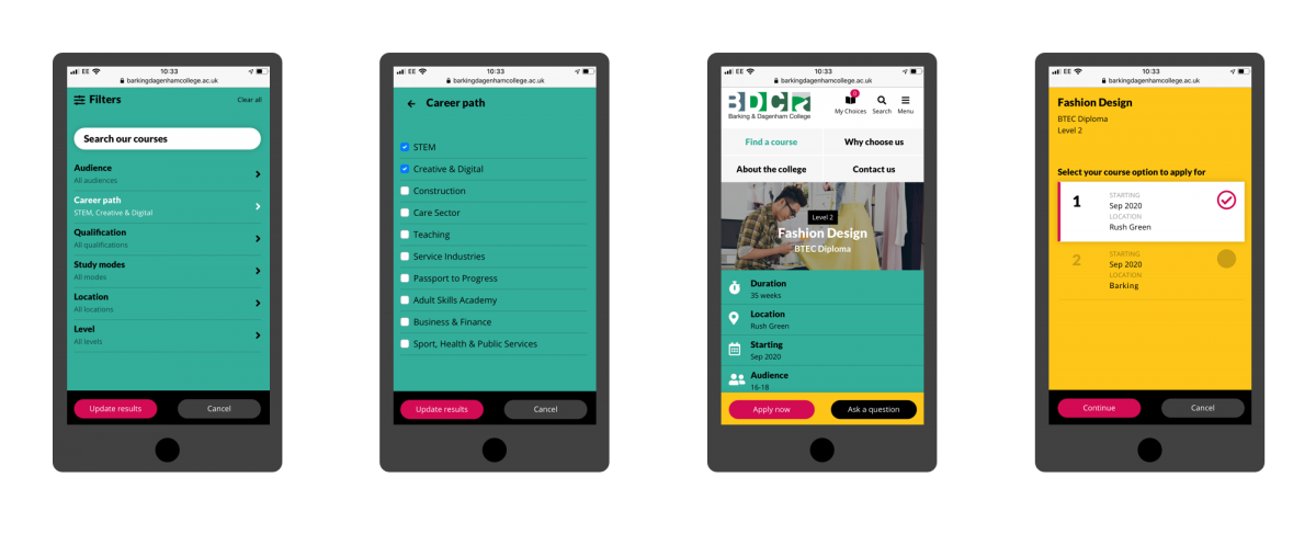
A key component of the design process was creating an easy to use course search and filtering system that worked well on small screens. We’ve seen many lovely looking search and filtering systems fail when viewed on small screens, so our research took us across all website types including ecommerce stores and holiday companies.
When opening the course filtering options on a small screen, the system we designed takes the user into a focused set of screens without the distraction of other on-page elements. When testing this feature we received incredibly positive feedback such as “it’s so easy, even my Gran could use it!”
Simple and structured content
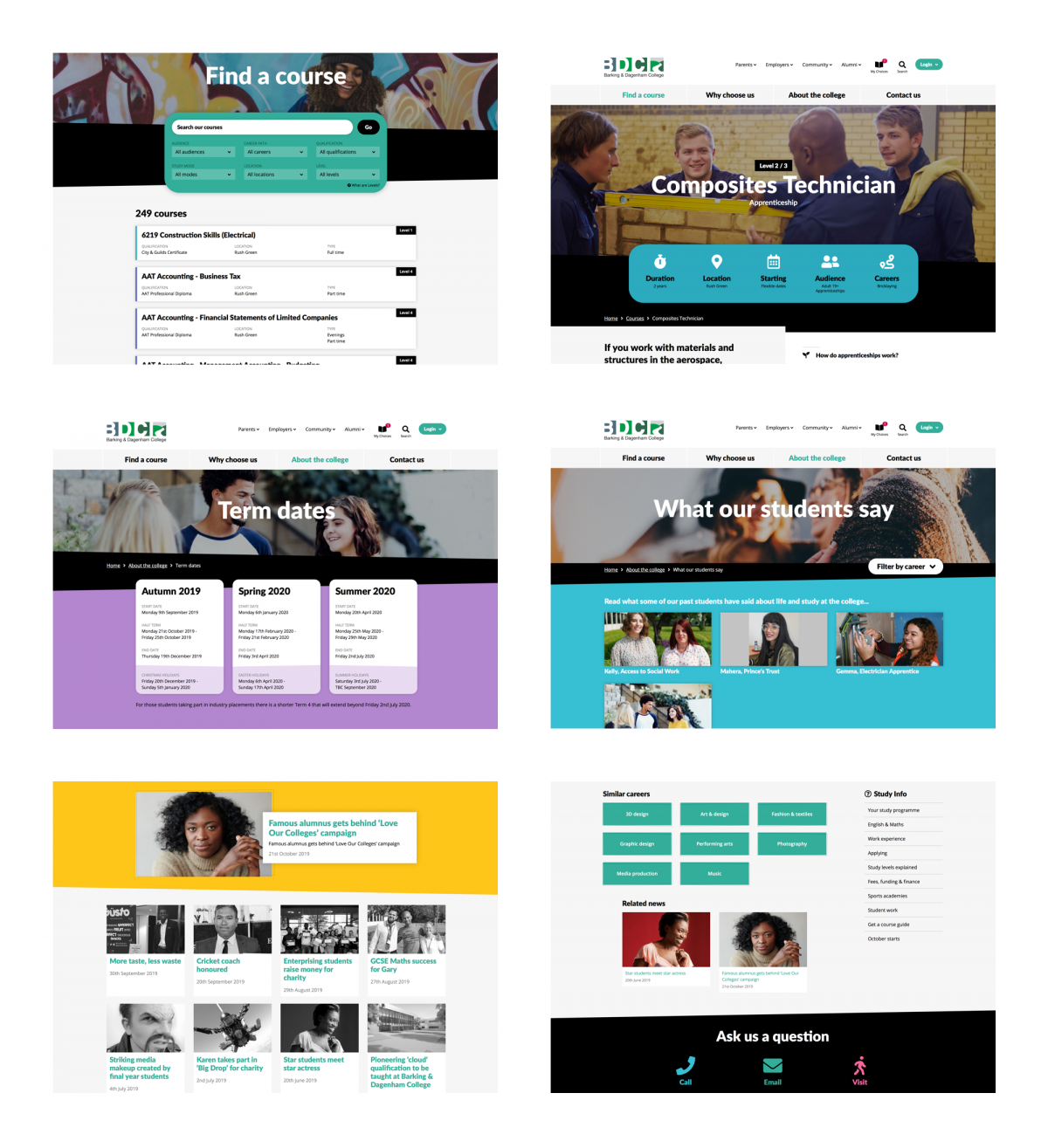
The design we created had to be easy to use and understand. There were many issues on the old website with too much content, or content that was too complex or too hard to find.
Usability testing on the old website (and competitor websites) confirmed that users were getting lost or confused easily, so the navigation structures and page layouts had to be clear, focused and simple.
We make use of white space, create simple and consistent places for page content, have clear sign-posting to other pages of interest and have simplified the navigation down to four key sections.
System development
We have built a website system that gives the college full control over their content and is built to be scalable and has capacity to grow with their requirements.
Unit-e integration
A key part of the brief and the development process was to develop and maintain a close relationship between the website and the college’s course management system, Unit-e.
We worked closely with the MIS and IT teams within the college over the course of the development phase to understand their course data, map it to the new website system and ensure an automated process would keep the two systems synchronised.
The system we have developed includes an automated process where course information is pushed from Unit-e and imported into the website system overnight to ensure new course data is automatically updated on the live website.
Auto-generation of personalised prospectuses
In early discussions with the college, we were keen to offer personalised content to users on the website. This grew into the ability for prospective students to create personalised prospectuses containing details of the courses they were interested in.
In the new website, students can add courses to their ‘My choices’ area and from here they can generate a personalised prospectus. A PDF file is generated based on their course choices and is populated with the actual website content from the CMS, for each course.
The system is developed to give as much flexibility to the college, in terms of the information that is used to create these prospectuses. The college marketing team can add introductory content and supplementary information for the prospectuses, all via the website CMS.
This ensures the generated PDFs contain the most up to date content.
What we did
- User experience
- User interface design
- Interactive prototyping
- Wireframing
- User research
- Usability testing
- Information architecture
- Visual design
- Responsive design
- Bespoke systems
- Website development

