Designing college websites
Having reviewed over 300 college websites we look at 5 reasons why a college website is successful.
We have been designing websites and digital tools for the education sector since 2003, which gives us a great deal of experience in the sector. Whilst much of our knowledge and insight comes from the sessions we run with staff and students at colleges, we are also very aware of the sector as a whole and attempt to keep up with what others are doing.
As such, we spend a lot of time on college websites; researching, testing and looking at the different ways colleges try to engage with students.
Of course some are more successful than others, however this all helps us best understand what works well. With a view to informing our own design decisions, which in turn benefits our college clients.
We’ve recently reviewed over 300 FE college websites from across the UK and want to share some of what we learned. To offer a considered view of what we feel works well and what should be the main focus when designing a new website for your college.
In this article we will reference 5 websites that we feel do things very well. Or offer a unique approach in helping students get started at their college.
And to ensure impartiality, we haven’t included any of the college websites we have designed here at Float!
1. Personality
It might seem obvious to say, however your website should convey the personality of your college. A sense of place, the feeling you get when you walk through a bustling campus, who are your students what it’s really like to be a student. And what makes your college unique.
We often see that colleges have a very shiny and exciting printed prospectus, yet the website feels like a poor cousin. Related because of the logo and colour scheme, but missing the same energy. Of course designing a great website is hard and requires a decent budget. But it is incredibly important!
The Crawley College website instantly engages. It grabs your attention, feels alive, is bright and refreshing and you immediately get a sense of place. Its design seems firmly aimed at their 16 year old audience and we think this is pitched just right.
We’ll reference Crawley College again, simply because we think it’s a great website.
2. Instantly engaging
Again, it might seem an obvious one but you want your website to instantly hit the mark with the person looking at the site. You know your types of audience so your website must reach out to each of them, offer a hand and bring them in through the front door.
Birmingham Metropolitan College (BMet) has a great website. It’s homepage has a full screen rolling banner with large photography, but the really interesting aspect are the three yellow boxes offering you a way in:
- “I know what I want to study”
- “I know where I want to study”
- “I know what career I want”
Clicking on each of these boxes gives options to select your interest and BOOM! They’ve got you in through the door and are presenting you with related courses just by saying you’d like to be a plumber. It works really well.
Engaging people is also about context - letting them know they’re in the right place and you have something that will interest (and hopefully excite) them!
Large banner images or looping videos on a homepage can work well to set the scene. They immediately define the context and hopefully say to a prospective student that this is the place for them. You should be inspiring people to want to find out more, therefore that offer of a hand you’re holding out should be firmly grasped!
Franklin Sixth Form College do this really well. They have a 20 second video that plays silently on a loop, showing various aspects of student life. In the classroom shots, sports, socialising, students laughing…
It may seem obvious (as a lot of these things do) but it’s implemented really well. It’s snappy, with quick cuts between scenes and isn’t at all laboured. It’s a great snapshot of college life.
What they also do really well is place their course search right on top of this video, presenting a really clear route into the website.
A note of caution, however, must also be applied to the use of large banners. When used well, like on Crawley College's website, they offer a really powerful way to highlight key messages and pull people into the website.
However we see many instances where a college sees this as a way to promote everything. And an office junior is tasked with creating a hero image using whatever fonts and colour palette they have access to to. Which instantly clashes with the overall design ethic of the site and isn’t consistent with brand or visual feel.
So use with caution. And remember not everyone is a designer!
3. Make finding a course easy
Drilling through hundreds of courses on a college website can be hard work. For those students who don’t know the exact courses they want to do, a college website should be doing all it can to suggest options and make the discovery phase really engaging and interesting.
We’ve seen many methods of presenting courses, often with complex filtering systems. However the ones that work best are the simplest.
Don’t make your users work hard to sort through your courses - the website should be doing this behind the scenes and presenting the user with possibilities, not complex filtering tasks.
The Manchester College’s website presents a couple of really nice routes into their course information and content.
Their option to “Find your perfect career” works really nicely as a discovery phase. A box from the homepage takes you into a section where they display 20 career sectors, each highlighting average salaries. Clicking on a sector takes you to a page where they give an introduction to this sector, show possible careers with average salaries and list how many jobs were available in 2016, the predicted number for 2020 and the average salary.
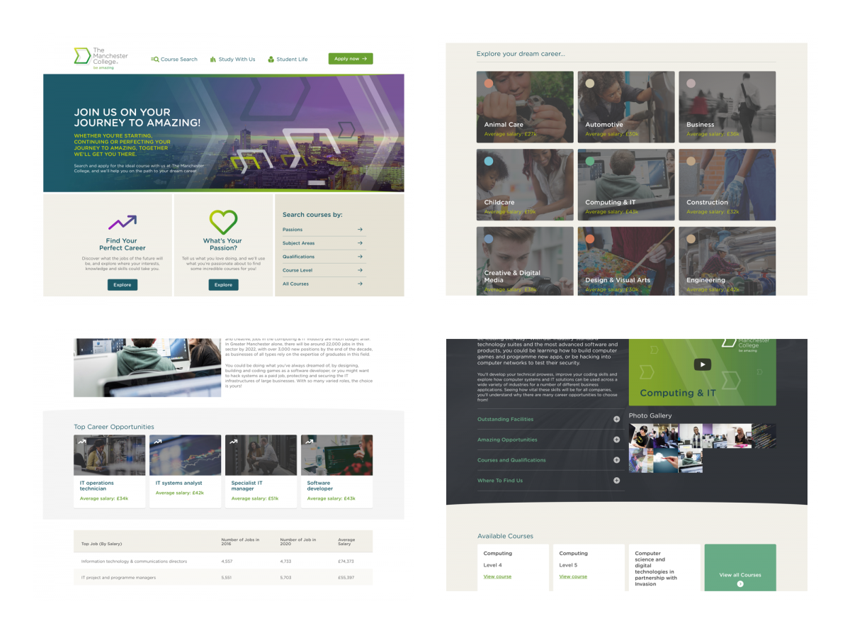
We've not just put together a list of possible careers you might want to follow, we've gathered the kind of information you'll need to make the best possible choice about your future. As well as seeing how much you could expect to earn from an annual salary in a variety of roles in any given sector, you'll also find out just how many jobs are available in the north west and how that might change over the coming years.
This means that you can see exactly where your skills and expertise are likely to be needed in a few years time, so you can get out ahead of the crowd and secure employment doing something you're passionate about.
A second route into the website from the homepage is a question about “What is your passion?”.
Note that neither of these options are the traditional “search for a course”, where there’s an expectation that you know what you’re looking for.
Taking the “passion” route allows you to select the things you’re passionate about. And as you’re doing this, the website is compiling a list of courses based on your selections and adding them to a virtual shopping basket, telling you that it’s found “83” courses based on your passions.
Ultimately, you could have found these same 83 courses using their traditional filtering mechanisms, however the “passion” feature takes away the hard work of doing this. And it’s also different. And a little quirky. But really engaging.
We’re talking here about what makes it easy to discover courses, yet equally important is when you find a course you need the information to be presented in an intuitive way and easy to understand.
Stockport College’s website makes things very clear. You select a subject area, such as “Art and Design”, from which you can go straight into a course. They use a bold blue banner at the top of the page to highlight the key content such as course code, the apply online button and an option to print the page. It’s a simple, no fuss approach to what can often be complex content.
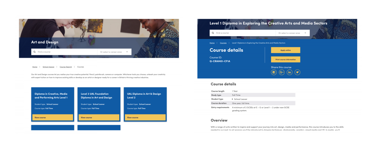
Similarly, Crawley College’s course page offers a clear and focused way of presenting key course details and information.
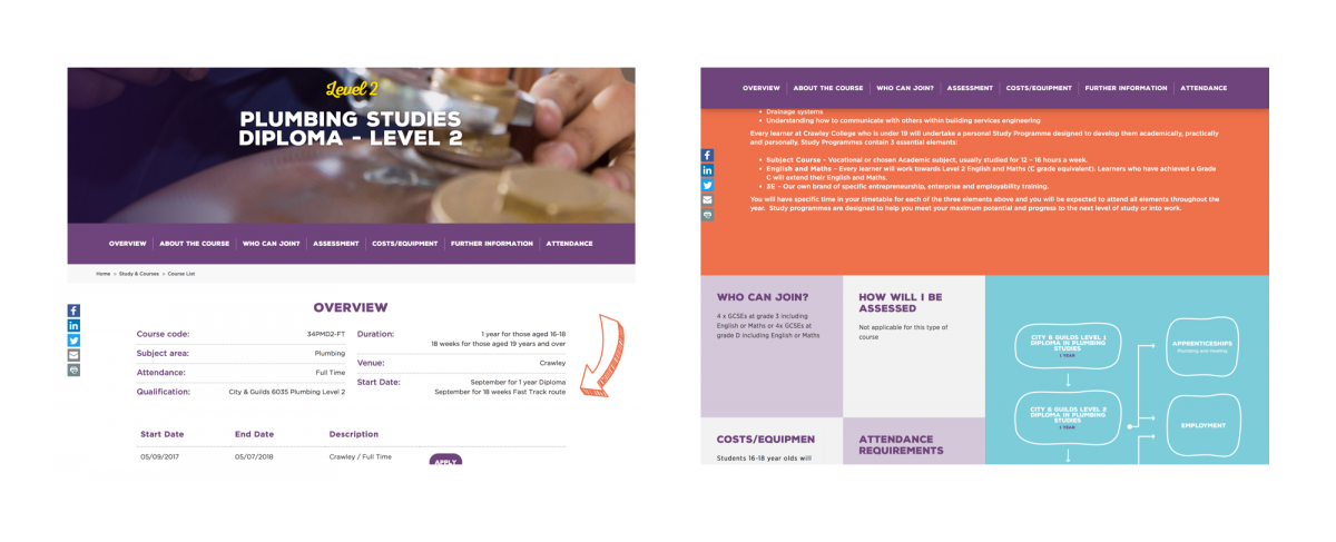
An overview section pulls out the key stats and relevant numbers, start and end dates and an option to apply. Then the main flow of content is broken down into clearly defined sections separated using colour. A sticky navigation helps you jump between sections, making the whole course information accessible and easy to consume.
4. Must be great on a mobile
I’m sure you’ve heard a statistic about mobile usage and it probably changes all of the time. Was it over 35%? Or 47%? Ultimately it doesn’t matter. What’s clear is that more and more prospective students are using their mobiles to access your website. And tablets too.
So your website must be responsive and present content in a suitable way based on the screen size of the user’s device. There’s no counter-argument to this anymore. It simply must.
To be honest, of the 500 websites we reviewed the majority are responsive. Which is good.
However, not all offered great experiences. You can’t simply design a website for a desktop size screen then make it squishy so it all collapses down when on a small screen. If you’re doing this, you’re missing the point somewhat.
You need to ensure you design great experiences for users when viewing your website on a small screen.
To highlight this point, I’m going to show a screenshot from a page of The Manchester College’s website.
I’ve previously said how good this website is and I don’t take this back. However what I hope to highlight here is that designing for small screens is hard. You can’t simply just squish the sides in and expect it to work well.
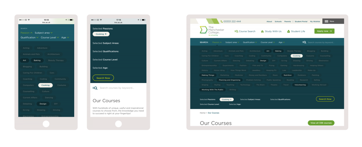
In this instance, the course search tool opens up a set of tags to filter the list of courses. On a desktop size screen this works reasonably well as they never take up the whole screen. Whilst a little intimidating, it’s not a bad way to refine courses.
However when viewing this same filtering mechanism on a phone, it takes over the whole screen and isn’t clear what happens when you press on an option. The resulting “Search now” button is further down, off the screen somewhere. And remember this is the main course search tool on the website.
So it could really do with a bit more thought to ensure the user experience on a mobile device is much smoother and more obvious.
5. Simple to use and easy to understand
When a website is deemed easy to use, this is due to many factors. And more than I can list here. However I feel the following are pretty important.
Navigation options must be clear, use simple terminology and be limited to only a few options.
Content should be appropriate, not long-winded and where possible longer pages of copy should be supported by imagery and video content.
In many cases, it may be that video is a better medium to get across a point than a long page of text.
Appropriate use of language is incredibly important. As we all know, education institutions have a whole variety of abbreviations and acronyms that may make perfect sense to staff within that institution. But that doesn’t mean a 16 year old prospective students knows what they mean. Or indeed their parents.
So it is imperative to use clear and concise words and phrases. But this doesn’t mean you’re dumbing down the content - you're making it accessible to all.
And on the web, you need to forget what you know about paragraphs and constructing them from multiple sentences. Often a single sentence should equate to a paragraph.
A simple page of text is much quicker to consume, meaning more people will read the copy. Which is the whole point of writing it, isn’t it?!
When reviewing college websites we often see sites trying to fit many options into the main navigation. Of course we understand it’s hard. Different stakeholders from across the college will want their specific pages in the main navigation as they are “very important”.
However in feeding lots of options into a navigation will only present the user with too many choices and lead to confusion. More choice does not equate to a better user experience.
It is our job, and yours, to understand your content and present it in a way that engages the user. To know what the key sections are, and present them in a clear way.
The following three examples of website navigation are from Crawley College, Franklin Sixth Form College and The Manchester College.
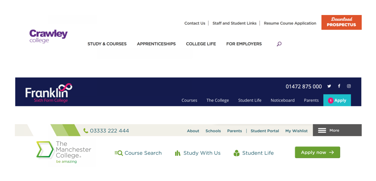
Keeping the main set of options to five or less really helps focus the user’s attention. There’s no place for them to get distracted and their decision making process of what to click on will be much quicker.
With ten options on the screen, people would need time to consider the options and decide where something may live. But with only four options, that decision becomes much easier and users quickly get to where they're going with less stress.
What these three websites all do, and is quite a convention, is to offer a fuller set of links in the footer of each page. As the user scrolls to the bottom of a page it offers a route of where to go next.
Often these are titled as “Quick links” - which tells the user the college has deemed them important enough to flag up again. Which is a way for the college to lead the user to content it wants them to see. Or feels they should see.
Is it really that simple?
Most of what we’ve covered in this article may seem obvious. And in many cases, it really is that simple.
You know your college better than anyone and your website should be an extension of the college. Of all its aspects.
Of course implementing these things in a website isn’t always that simple. You have multiple stakeholders who each want to have their say and input.
But that’s where an external agency can help. And we would love to help!
Published 29th September 2017


